
Custom Slider allows a Slider control to look the way you want, this is done using Control Templates to change the control's visual elements without changing the behaviour of the control, allowing the Slider to be customised.
Printer Friendly Download Tutorial (145KB) Download Source Code (6.19KB) Online Demonstration
Step 1
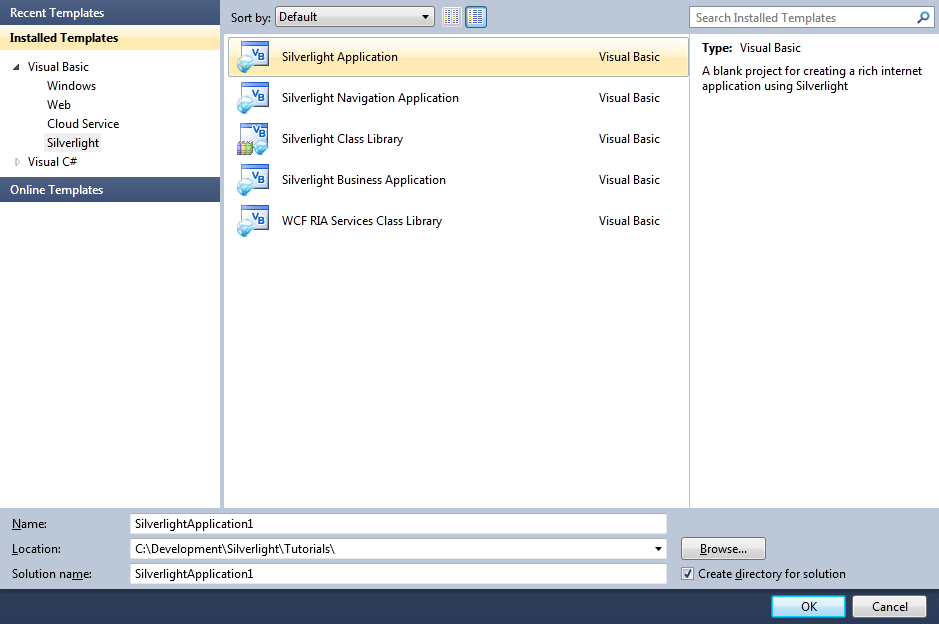
Start Microsoft Visual Web Developer 2010 Express, then Select File then New Project... Select "Visual Basic" then "Silverlight Application" from Templates, select a Location if you wish, then enter a name for the Project and then click OK, see below:
Step 2
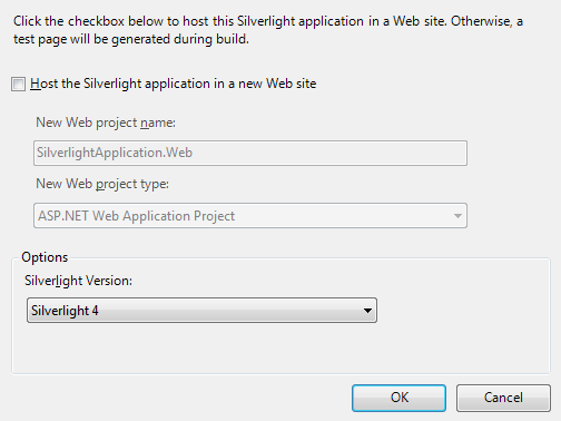
New Silverlight Application window should appear, uncheck the box "Host the Silverlight Application in a new Web site" and then select the required Silverlight Version, see below:
Step 3
A Blank Page named MainPage.xaml should then appear, see below:
Step 4
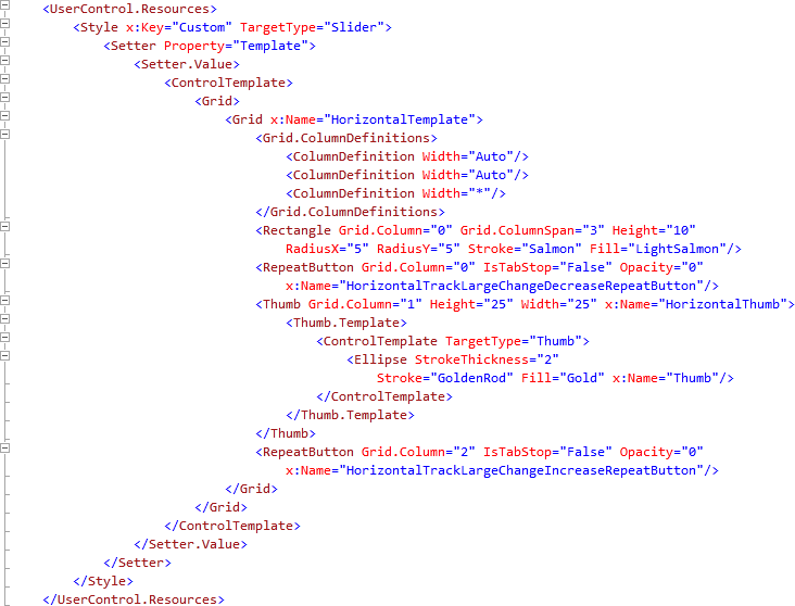
In the XAML Pane for the MainPage.xaml, above the "<Grid>" and below the top "<UserControl>" tag, type the following XAML:
<UserControl.Resources>
  <Style x:Key="Custom" TargetType="Slider">
    <Setter Property="Template">
      <Setter.Value>
        <ControlTemplate>
          <Grid>
            <Grid x:Name="HorizontalTemplate">
              <Grid.ColumnDefinitions>
                <ColumnDefinition Width="Auto"/>
                <ColumnDefinition Width="Auto"/>
                <ColumnDefinition Width="*"/>
              </Grid.ColumnDefinitions>
              <Rectangle Grid.Column="0" Grid.ColumnSpan="3" Height="10"
                RadiusX="5" RadiusY="5" Stroke="Salmon" Fill="LightSalmon"/>
              <RepeatButton Grid.Column="0" IsTabStop="False" Opacity="0"
                x:Name="HorizontalTrackLargeChangeDecreaseRepeatButton"/>
              <Thumb Grid.Column="1" Height="25" Width="25" x:Name="HorizontalThumb">
                <Thumb.Template>
                  <ControlTemplate TargetType="Thumb">
                    <Ellipse StrokeThickness="2"
                      Stroke="GoldenRod" Fill="Gold" x:Name="Thumb"/>
                  </ControlTemplate>
                </Thumb.Template>
              </Thumb>
              <RepeatButton Grid.Column="2" IsTabStop="False" Opacity="0"
                x:Name="HorizontalTrackLargeChangeIncreaseRepeatButton"/>
            </Grid>
          </Grid>
        </ControlTemplate>
      </Setter.Value>
    </Setter>
  </Style>
</UserControl.Resources>
See below:
Step 5
Return to the MainPage Designer View by selecting the "MainPage.xaml" Tab.
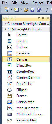
Then from the All Silverlight Controls section in the Toolbox select the Canvas control:
Step 6
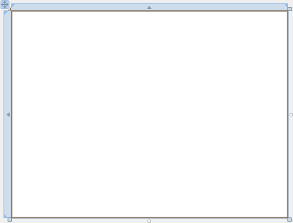
Draw a Canvas that fill the whole Page or in the XAML Pane between the "<Grid>" and "</Grid>" lines type the following XAML:
<Canvas Height="300" Width="400" HorizontalAlignment="Left" VerticalAlignment="Top" Name="Page">
</Canvas>
See below:
Step 7
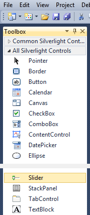
Then from the All Silverlight Controls section in the Toolbox select the Slider control:
Step 8
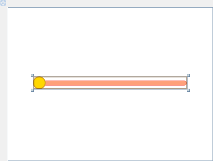
Draw a Slider on the Page by dragging a Slider from the Toolbox onto the Canvas then in the XAML Pane inbetween the "<Canvas>" and "</Canvas>" tags change the "<Slider>" line to the following:
<Slider Canvas.Left="50" Canvas.Top="135" Height="25" Width="300" Style="{StaticResource Custom}"/>
See below:
Step 9
Save the Project as you have now finished the Silverlight application. Select Debug then Start Debugging or click on Start Debugging:
After you do, the following will appear in a new Web Browser window:

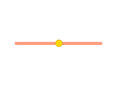
Step 10
You can then click and hold-down on the "Thumb" of the Slider (shown as a Circle) and drag it along the "Track" of the Slider as normal, see below:
Step 11
Close the Application and Browser window by clicking on the Close Button  on
the top right of the Application Window and Web Browser to Stop the application.
on
the top right of the Application Window and Web Browser to Stop the application.
It is possible to customise the appearance of any Silverlight Control such as the Slider to give your application a unique look-and-feel, without affecting the behaviour of the control so you can treat it still as a Slider. Why not try this with other controls such as the ComboBox or ListBox - make them your own!
