
Expander Control is a Collapsible panel, which when collapsed shows only header and button, when expanded the content is displayed using Silverlight for Windows Phone 7.
Printer Friendly Download Tutorial (644KB) Download Source Code (20.5KB)
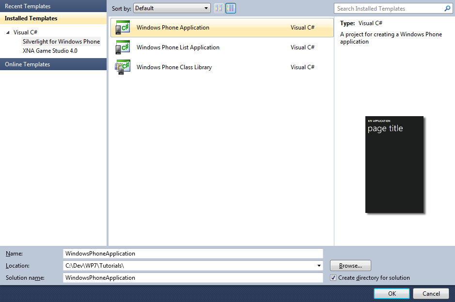
Step 1
Start Microsoft Visual Studio 2010 Express for Windows Phone, then Select File then New Project... Select "Visual C#" then "Silverlight for Windows Phone" and then "Windows Phone Application" from Templates, select a Location if you wish, then enter a name for the Project and then click OK, see below:
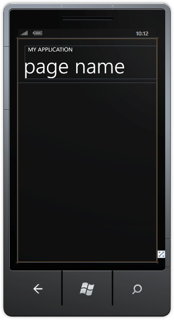
Step 2
A Windows Phone application Page named MainPage.xaml should then appear, see below:
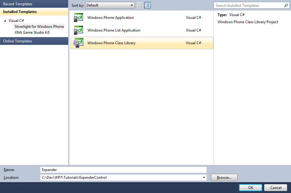
Step 3
Select from the Main Menu "File" then "Add", then "New Project...", and select the "Windows Phone Class Library" Template, then change the "Name" to Expander see below:
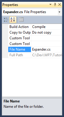
Step 4
Add the New Class Library Project by Clicking on Add, then in the Solution Explorer for "Expander", click on the "Class1.cs" entry, then goto Properties and change the File Name property to "Expander.cs" (without the quotes), see below:
Step 5
In the "You are renaming a file. Would you also like to perform a rename in this project of all references to the code element 'Class1'?" choose Yes.
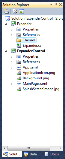
Right Click on the Entry for the "Expander" Project (not Expander.cs) in Solution Explorer and choose "Add" then "New Folder",
and give it the Name "Themes" (again without quotes), see below:
Step 6
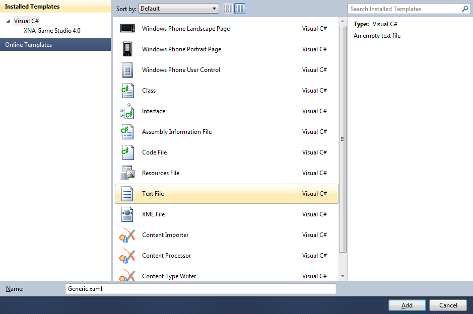
Right Click on the Entry for the "Themes" Folder for the Expander Project, and choose "Add", then "New Item...", select the "Text File" Template and change the name to "Generic.xaml", (without the quotes), see below:
Step 7
Add the Text File for the ResourceDictionary by Clicking on Add.
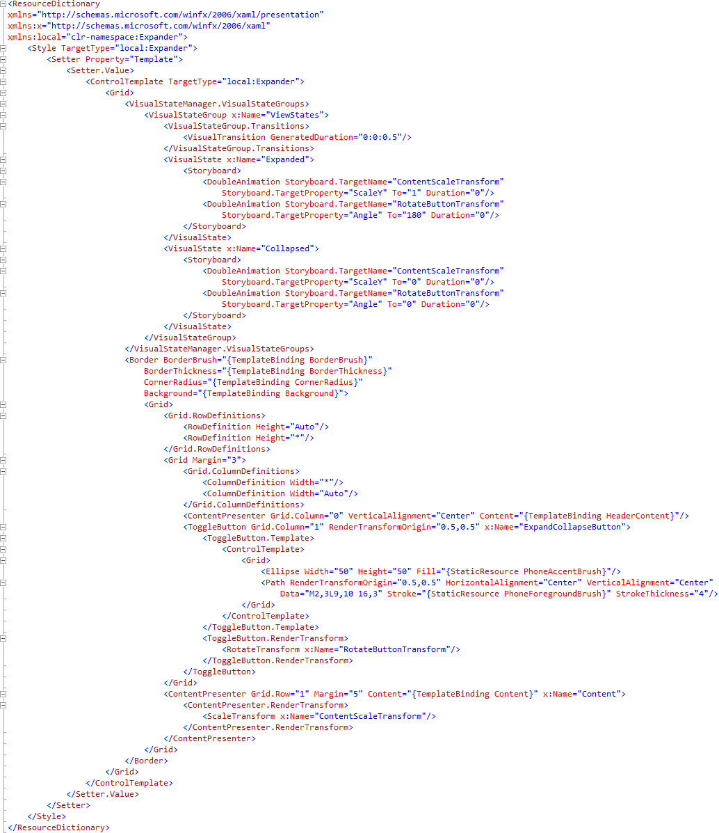
In the XAML Pane for the Generic.xaml type the following Resource Dictionary XAML:
<ResourceDictionary
xmlns="http://schemas.microsoft.com/winfx/2006/xaml/presentation"
xmlns:x="http://schemas.microsoft.com/winfx/2006/xaml"
xmlns:local="clr-namespace:Expander">
  <Style TargetType="local:Expander">
    <Setter Property="Template">
      <Setter.Value>
        <ControlTemplate TargetType="local:Expander">
          <Grid>
            <VisualStateManager.VisualStateGroups>
              <VisualStateGroup x:Name="ViewStates">
                <VisualStateGroup.Transitions>
                  <VisualTransition GeneratedDuration="0:0:0.5"/>
                </VisualStateGroup.Transitions>
                <VisualState x:Name="Expanded">
                  <Storyboard>
                    <DoubleAnimation Storyboard.TargetName="ContentScaleTransform"
                        Storyboard.TargetProperty="ScaleY" To="1" Duration="0"/>
                    <DoubleAnimation Storyboard.TargetName="RotateButtonTransform"
                        Storyboard.TargetProperty="Angle" To="180" Duration="0"/>
                  </Storyboard>
                </VisualState>
              <VisualState x:Name="Collapsed">
                <Storyboard>
                  <DoubleAnimation Storyboard.TargetName="ContentScaleTransform"
                      Storyboard.TargetProperty="ScaleY" To="0" Duration="0"/>
                  <DoubleAnimation Storyboard.TargetName="RotateButtonTransform"
                      Storyboard.TargetProperty="Angle" To="0" Duration="0"/>
                </Storyboard>
              </VisualState>
            </VisualStateGroup>
          </VisualStateManager.VisualStateGroups>
            <Border BorderBrush="{TemplateBinding BorderBrush}"
                BorderThickness="{TemplateBinding BorderThickness}"
                CornerRadius="{TemplateBinding CornerRadius}"
                Background="{TemplateBinding Background}">
              <Grid>
                <Grid.RowDefinitions>
                  <RowDefinition Height="Auto"/>
                  <RowDefinition Height="*"/>
                </Grid.RowDefinitions>
                <Grid Margin="3">
                  <Grid.ColumnDefinitions>
                    <ColumnDefinition Width="*"/>
                    <ColumnDefinition Width="Auto"/>
                  </Grid.ColumnDefinitions>
                  <ContentPresenter Grid.Column="0" VerticalAlignment="Center" Content="{TemplateBinding HeaderContent}"/>
                  <ToggleButton Grid.Column="1" RenderTransformOrigin="0.5,0.5" x:Name="ExpandCollapseButton">
                    <ToggleButton.Template>
                      <ControlTemplate>
                        <Grid>
                          <Ellipse Width="50" Height="50" Fill="{StaticResource PhoneAccentBrush}"/>
                          <Path RenderTransformOrigin="0.5,0.5" HorizontalAlignment="Center" VerticalAlignment="Center"
                              Data="M2,3L9,10 16,3" Stroke="{StaticResource PhoneForegroundBrush}" StrokeThickness="4"/>
                        </Grid>
                      </ControlTemplate>
                    </ToggleButton.Template>
                    <ToggleButton.RenderTransform>
                      <RotateTransform x:Name="RotateButtonTransform"/>
                    </ToggleButton.RenderTransform>
                  </ToggleButton>
                </Grid>
                <ContentPresenter Grid.Row="1" Margin="5" Content="{TemplateBinding Content}" x:Name="Content">
                  <ContentPresenter.RenderTransform>
                    <ScaleTransform x:Name="ContentScaleTransform"/>
                  </ContentPresenter.RenderTransform>
                </ContentPresenter>
              </Grid>
            </Border>
          </Grid>
        </ControlTemplate>
      </Setter.Value>
    </Setter>
  </Style>
</ResourceDictionary>
See below:
Step 8
Right Click on the Entry for the "Expander.cs" Class in Solution Explorer in the "Expander Project" and choose
"View Code" or Double click on "Expander.cs".
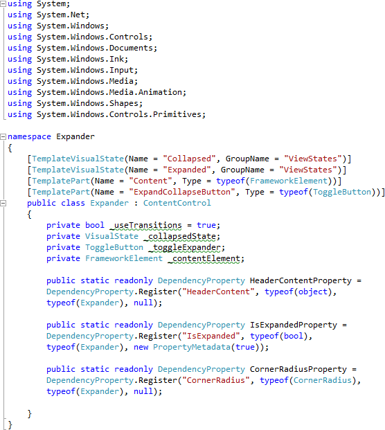
In the Code View for Expander above "namespace Expander" line type the following:
using System.Windows.Controls.Primitives;
Also in the CodeView above "public class Expander" type the following:
[TemplateVisualState(Name = "Collapsed", GroupName = "ViewStates")]
[TemplateVisualState(Name = "Expanded", GroupName = "ViewStates")]
[TemplatePart(Name = "Content", Type = typeof(FrameworkElement))]
[TemplatePart(Name = "ExpandCollapseButton", Type = typeof(ToggleButton))]
Again in the CodeView at the end of the line "public class Expander" type the following:
: ContentControl
And in the CodeView below the "{" of the line "public class Expander : ContentControl" type the following Declarations and Dependancy Properties:
private bool _useTransitions = true;
private VisualState _collapsedState;
private ToggleButton _toggleExpander;
private FrameworkElement _contentElement;

public static readonly DependencyProperty HeaderContentProperty =
DependencyProperty.Register("HeaderContent", typeof(object),
typeof(Expander), null);

public static readonly DependencyProperty IsExpandedProperty =
DependencyProperty.Register("IsExpanded", typeof(bool),
typeof(Expander), new PropertyMetadata(true));

public static readonly DependencyProperty CornerRadiusProperty =
DependencyProperty.Register("CornerRadius", typeof(CornerRadius),
typeof(Expander), null);
See Below:
Step 9
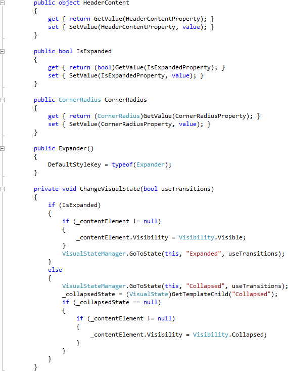
While still in the Code View below the "CornerRadiusProperty" declaration type the following Properties and Methods:
public object HeaderContent
{
  get { return GetValue(HeaderContentProperty); }
  set { SetValue(HeaderContentProperty, value); }
}

public bool IsExpanded
{
  get { return (bool)GetValue(IsExpandedProperty); }
  set { SetValue(IsExpandedProperty, value); }
}

public CornerRadius CornerRadius
{
  get { return (CornerRadius)GetValue(CornerRadiusProperty); }
  set { SetValue(CornerRadiusProperty, value); }
}

public Expander()
{
  DefaultStyleKey = typeof(Expander);
}

private void ChangeVisualState(bool useTransitions)
{
  if (IsExpanded)
  {
    if (_contentElement != null)
    {
      _contentElement.Visibility = Visibility.Visible;
    }
    VisualStateManager.GoToState(this, "Expanded", useTransitions);
  }
  else
  {
    VisualStateManager.GoToState(this, "Collapsed", useTransitions);
    _collapsedState = (VisualState)GetTemplateChild("Collapsed");
    if (_collapsedState == null)
    {
      if (_contentElement != null)
      {
        _contentElement.Visibility = Visibility.Collapsed;
      }
    }
  }
}
See Below:
Step 10
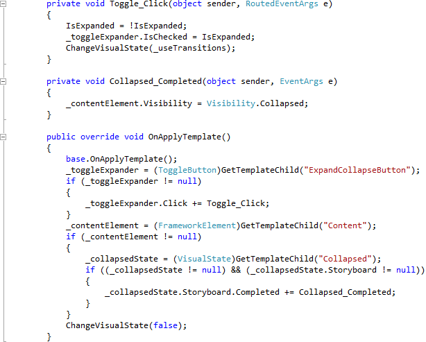
While still in the Code View below the "}" of the "ChangeVisualState" Method type the following Event Handlers:
private void Toggle_Click(object sender, RoutedEventArgs e)
{
  IsExpanded = !IsExpanded;
  _toggleExpander.IsChecked = IsExpanded;
  ChangeVisualState(_useTransitions);
}

private void Collapsed_Completed(object sender, EventArgs e)
{
  _contentElement.Visibility = Visibility.Collapsed;
}

public override void OnApplyTemplate()
{
  base.OnApplyTemplate();
  _toggleExpander = (ToggleButton)GetTemplateChild("ExpandCollapseButton");
  if (_toggleExpander != null)
  {
    _toggleExpander.Click += Toggle_Click;
  }
  _contentElement = (FrameworkElement)GetTemplateChild("Content");
  if (_contentElement != null)
  {
    _collapsedState = (VisualState)GetTemplateChild("Collapsed");
    if ((_collapsedState != null) && (_collapsedState.Storyboard != null))
    {
      _collapsedState.Storyboard.Completed += Collapsed_Completed;
    }
  }
  ChangeVisualState(false);
}
See Below:
Step 11
Select "Build Solution" from the Debug menu, see below:
Step 12
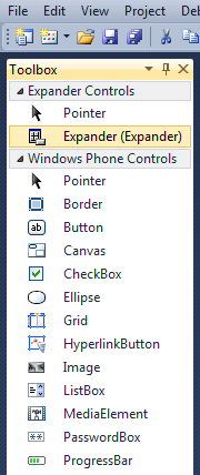
When the Build completes, return to the MainPage Designer View by selecting the "MainPage.xaml" Tab.
Then from the Expander Controls section in the Toolbox select the Expander control:
Step 13
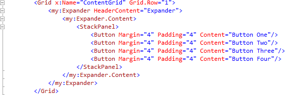
Draw an Expander onto the Page by dragging an Expander from the Toolbox onto the Page, then in the XAML Pane between the <Grid x:Name="ContentGrid" Grid.Row="1"> and </Grid> lines, change "expander1" to the following:
<my:Expander HeaderContent="Expander">
  <my:Expander.Content>
    <StackPanel>
      <Button Margin="4" Padding="4" Content="Button One"/>
      <Button Margin="4" Padding="4" Content="Button Two"/>
      <Button Margin="4" Padding="4" Content="Button Three"/>
      <Button Margin="4" Padding="4" Content="Button Four"/>
    </StackPanel>
  </my:Expander.Content>
</my:Expander>
XAML:
Design:
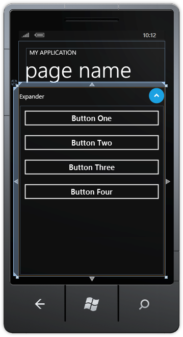
Step 14
Save the Project as you have now finished the Windows Phone Silverlight application. Select the Windows Phone Emulator option then Select Debug then Start Debugging or click on Start Debugging:
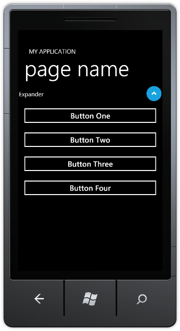
After you do, the following will appear in the Windows Phone Emulator after it has been loaded:
Step 15
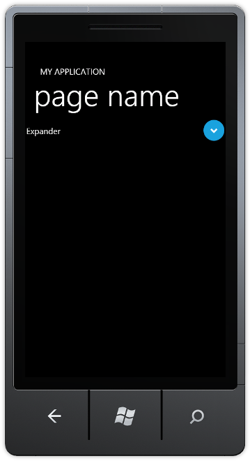
Tap the Round button with the Arrow to Collapse or Expand the Expander, see below:
Step 16
You can then Stop the application by selecting the Visual Studio 2010 application window and clicking on the Stop Debugging button:
This is a simple Expander Control example it could be extended to support more Properties such as HeaderContent Background colour for example, or adding more features - make it your own!
